







Creating a peaceful and relaxing environment in your home often starts with the colors you choose. Calm colors can transform your living space into a soothing sanctuary where you feel comfortable and refreshed. Whether you’re redecorating a single room or your entire home, picking the right calm colors can make a big difference.
In this post, we’ll explore practical tips for selecting calm colors that suit your style and enhance your home’s atmosphere.
Why Choose Calm Colors?
Calm colors are soft, muted tones that promote relaxation and reduce stress. Unlike bold or bright shades, these colors don’t overwhelm the senses. Instead, they create a balanced, cozy feeling that helps you unwind after a long day.
Common calm colors include gentle blues, soft greens, warm neutrals, and light grays. These hues often mimic natural elements like the sky, ocean, or forests, contributing to a serene ambiance.
Tips for Choosing Calm Colors for Your Home
1. Identify the Purpose of Each Room
Before picking a color, consider how you will use the room:
– Bedrooms: Ideal for resting, so go for tranquil colors like soft blues, lavender, or muted greens.
– Living rooms: Since this is where you entertain or relax, warm neutrals or subdued earth tones work well.
– Bathrooms: Light blues, pale greens, or crisp whites create a spa-like feel.
– Home offices: Choose calm shades that promote focus without being too dull, such as soft gray or gentle aqua.
Matching the color to the room’s function will enhance the overall mood and usability.
2. Use a Color Palette with Harmonious Shades
When selecting calm colors, it’s helpful to work with a cohesive palette that combines several related shades. This approach creates depth and interest while maintaining a peaceful vibe.
For example, if you choose a soft blue as your main color, consider pairing it with lighter or darker shades of blue, gentle grays, or creamy whites. A harmonious palette helps ensure that your space feels put together and balanced.
3. Test Colors in Different Lighting Conditions
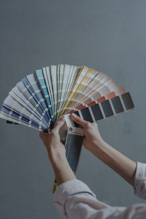
Colors can look very different depending on the light in your home. Natural sunlight, artificial lighting, and time of day all affect how the paint appears on your walls.
To avoid surprises, try these steps:
– Paint small sample patches on your walls.
– Observe the colors at various times—morning, afternoon, and evening.
– Look at the colors in different parts of the room to see how light affects them.
This way, you’ll choose a calm color that looks beautiful throughout the day.
4. Consider the Undertones
Every color has an undertone, which can be cool (blue, green, or purple) or warm (yellow, orange, or red). Even calm colors can have different feelings depending on their undertones.
For example, a soft beige with warm undertones feels cozy and inviting, while a pale gray with cool undertones gives a sleek and modern look.
Think about the overall style and atmosphere you want to create when choosing the undertones of your calm colors.
5. Balance Calm Colors with Texture and Accents
Calm colors work beautifully with various textures and accents to add personality and warmth. Consider:
– Soft fabrics like cushions, throws, and rugs in neutral or complementary calm colors.
– Natural materials such as wood, stone, or plants to add organic warmth.
– Metallic accents in brushed brass or matte finishes to introduce subtle shine without overpowering.
Using textures and small accents enhances the calming effect while keeping your space visually interesting.
6. Keep It Simple but Flexible
While it’s tempting to experiment with many colors, simplicity often leads to a more calming environment. Limit your main palette to two or three calm colors, then use accents to introduce variety.
At the same time, choose colors that you can easily update with décor accessories if your preferences change over time. Neutral calm colors like soft gray or beige are excellent bases for this flexibility.
Popular Calm Color Choices for Homes
Here are some classic calm colors that work well in many homes:
– Soft Blue: Evokes the sky or sea, promoting tranquility.
– Muted Green: Brings nature indoors and encourages relaxation.
– Warm Beige: Offers a cozy, inviting feel without being too bold.
– Light Gray: Modern and neutral, ideal as a base color.
– Lavender: A gentle pastel that adds a touch of calm sophistication.
– Pale Taupe: Neutral with subtle warmth for balanced spaces.
Final Thoughts
Choosing calm colors for your home is an excellent way to create a peaceful retreat. Take your time to explore different shades, consider how lighting and undertones affect your choices, and complement your palette with textures and accents.
With these tips, you’ll be well on your way to designing a home filled with calm, comfort, and style. Enjoy the process and the relaxing atmosphere you create!